Accessibility ensures that everyone can engage with your content – including people with visual, auditory, cognitive or motor disabilities. It is not just a legal requirement across Europe; it’s a core value for inclusive science communication.
Crucially, accessibility is not a design topic. It applies to your writing, your slides, your website, your social posts and your printed materials alike. A jargon-heavy paragraph, a table saved as a picture, or a video with no captions are all accessibility failures – and none of them are about “design” in the visual sense.
The four principles (WCAG)
The Web Content Accessibility Guidelines (WCAG) are the international standard. They’re built on four principles – a useful checklist for anything you produce, not just web pages:
- Perceivable – content can be seen or heard by everyone (e.g. ALT text for images, captions for videos).
- Operable – all functions can be used by keyboard, mouse or assistive technology.
- Understandable – content is clear, instructions are simple, and navigation is logical.
- Robust – content works across different devices and assistive technologies.
What is ALT text?
ALT text (alternative text) is a short written description attached to an image. Screen readers read it aloud to people who can’t see the image, and it appears if the image fails to load. It is invisible to most sighted users – but for some readers, it is the image.
The goal of ALT text is to convey the same information or function the image provides, as briefly as possible. It is not a caption, and it is not a place to repeat the surrounding text.
Good vs. poor ALT text
| Image | Poor ALT | Better ALT | Why |
|---|---|---|---|
| Photo of a researcher presenting at a podium | image1.jpg / “photo” |
“A researcher presents ELIXIR’s annual results to an audience at the AHM” | Filenames and “photo” tell the reader nothing |
| Logo linking to the homepage | “logo” | “ELIXIR — go to homepage” | ALT should describe the link’s function, not just the picture |
| A chart showing data | “chart” / “graph of results” | Summarise the point: “Bar chart: training registrations doubled from 2023 to 2025” | The reader needs the takeaway, not the chart type |
When an image needs no ALT text
Not every image carries information. Purely decorative images – a background flourish, a divider line, a stock photo that adds atmosphere but no meaning – should have empty ALT text (alt=""). This tells the screen reader to skip it, rather than announcing “image” and interrupting the reader for nothing.
- Carries meaning → describe it.
- Purely decorative → empty ALT (
alt=""). - Repeats text that’s already right next to it → empty ALT, so it isn’t read twice.
The big one: is it really an image, or is it text in disguise?
This is the most common and most damaging mistake. People frequently save text or data as a picture – a table screenshotted from a spreadsheet, a quote turned into a graphic, a list of bullet points exported as a PNG, a chart with the numbers baked into the image.
To a sighted reader it looks fine. But for everyone else (or machines) it is a dead end:
- A screen reader can’t read it – at best it reads your ALT text, which can never contain a whole table.
- It can’t be selected, copied, searched or translated.
- It blurs when zoomed, which hurts readers with low vision.
- It breaks on small screens.
Example – a table
The problem (a table saved as an image):
[An image file,
q3-results.png, showing a 4-column table of registration figures.] ALT: “Table of training registrations by quarter.”
That ALT can never carry the actual numbers, so a screen-reader user gets nothing usable – and no one can copy the figures.
The fix (the same content as real text):
| Quarter | Registrations | Completed | Completion rate |
|---|---|---|---|
| Q1 2025 | 120 | 96 | 80% |
| Q2 2025 | 180 | 153 | 85% |
| Q3 2025 | 240 | 211 | 88% |
Now every reader gets the data, it can be copied and searched, and it reflows on mobile. The same logic applies to charts (provide the underlying figures as a small table or in the text), quotes (use real quoted text, not a graphic), and infographics with key statistics (repeat the statistics in the body text).
When an image genuinely is an image – but a complex one
Some images really are images – a diagram, a workflow, an infographic, a scientific illustration – and short ALT text isn’t enough to convey them. In that case, give both: short ALT text that names the image, and a longer description nearby (in the body text or a caption) that conveys the actual information.
An image that helps the reader understand the text should not be standalone, it should aid in understanding a concept.
Example – an infographic
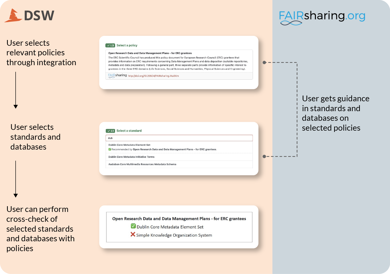
Take this diagram from an ELIXIR-UK blog post on the Data Stewardship Wizard (DSW) and FAIRsharing. It shows how the two tools exchange information so that, as a researcher fills in a Data Management Plan, they get as-you-type hints for the right standards and databases.
To make a complex image like this accessible, do three things:
- Add short, functional ALT text that names what the image is.
- Provide a fuller description in the body text, so the information exists outside the image.
- Use high-contrast colours – ideally ELIXIR’s official palette.
Here’s the division of labour for the diagram above:
ALT: A diagram showing how FAIRsharing feeds the Data Stewardship Wizard, surfacing standards, databases and policies as a researcher fills in a Data Management Plan.
Description: DSW uses FAIRsharing to provide as-you-type hints for policies. Where those policies recommend specific standards and databases, that information is surfaced to users as they choose the resources associated with their Data Management Plan.
Beyond images
Accessibility is broader than pictures. The same principles apply to how you structure and present everything:
- Use sufficient colour contrast between text and background.
- Choose clear, simple fonts. Lato and Open Sans are our defaults; otherwise use trusted ones like Arial, Calibri or Helvetica. Avoid decorative text and keep text at least 12px.
- Add ALT text to all informative images, and empty ALT (
alt="") to decorative ones. - Keep tables, data, quotes and headings as real text – never as images.
- Structure content with headings (H1, H2, H3) in logical order, so screen readers and all users can navigate.
- Make links descriptive – avoid “click here”; use text that explains the link’s purpose (e.g. “Download the ELIXIR annual report”).
- Don’t rely on colour alone. Underline links, and don’t underline headings that aren’t links.
- Ensure keyboard navigation – users should be able to move through a page or document without a mouse.
- Provide captions or transcripts for videos.
- Test with an accessibility checker, or by using your content with a screen reader.
Exercise: audit one of your pages
- Choose a page or document your Node has published online.
- Check: does every informative image have useful ALT text? Are any tables, charts or quotes actually images? Is the text easy to read? Can you navigate using only the keyboard?
- Run it through a free accessibility checker such as WAVE or Axe, and fix what it flags.
Dive deeper
| Category | Resource | Description |
|---|---|---|
| External resource | WAVE web accessibility evaluation tool | Free in-browser tool that flags accessibility issues (missing ALT text, low contrast, heading structure) on any web page. |
| External resource | Axe accessibility checker | Free accessibility testing tool, available as a browser extension, for finding and fixing WCAG issues. |
| External resource | Web Content Accessibility Guidelines (WCAG) overview | The international standard for digital accessibility, built on four principles - perceivable, operable, understandable, robust. |